
The Opportunity
Customers faced a fragmented post-booking experience:
-
No centralized location for managing trips
-
Lack of real-time updates or servicing tools
-
Difficulty accessing benefits like lounge info or price protection
-
Missed opportunities to inspire repeat bookings after a trip
We set out to design a unified mobile hub that solved these problems while driving long-term loyalty.
The Approach
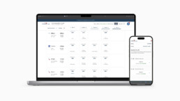
We combined research insights, live data integration, and modular design patterns to bring trip management directly into the Capital One app.
Structuring the Funnel for Conversion
-
1. Research & Strategy
We analyzed NPS verbatims, internal surveys, and complaints to identify the biggest pain points:
-
“I don’t know where to find my trip details”
-
“I want reminders, not just confirmation emails”
-
“Why doesn’t this connect to everything I booked?”
These led to three core experience themes:
-
Centralized Source: One place for all trip data
-
Reliability: Timely, accurate updates users can trust
-
Speed & Access: Easy self-service and automation
2. Design Principles
We established clear design goals:
-
Use EASE system patterns for scalability
-
Integrate Hopper’s live data feeds for real-time accuracy
-
Prioritize top actions like check-in, rebooking, or price watch
-
Create a repeatable layout for trip cards and servicing flows
-
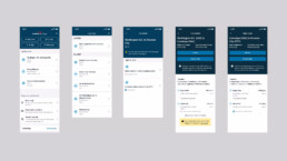
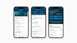
Key Experience Features
-
Trip Overview
A timeline view of upcoming trips, bookings, and real-time changes -
Smart Actions
Integrated links for check-in, managing bookings, and travel disclosures -
Lounge Benefits
Proximity-based lounge access, capacity updates, and departure reminders -
Trip Prep Support
Day-of-travel checklists and alerts tailored to itinerary data -
Loyalty Reminders
Recaps of rewards earned and personalized rebooking suggestions -
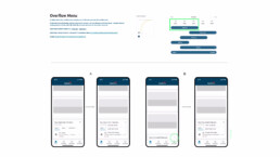
Scalable Motion-Based Navigation
On the Level App landing, we introduced motion interactions to enhance navigation across booking categories—flights, hotels, cars, and more. This marked one of the first initiatives to use motion design as both a UX tool and brand differentiator, helping users intuitively move through a complex, multi-line travel experience. This motion-forward system laid the groundwork for scalable design across future product surfaces.
Results & Impact
The launch of Travel Hub 2.0 delivered measurable improvements in usability and engagement:
-
+70 NPS (Consumer) from users who engaged with the new itinerary experience
-
60% repeat usage within the first six months
-
Increased trust and servicing NPS through transparency and automation
-
Broader adoption of Capital One Travel benefits beyond the booking moment
-
Scalable UI system adopted across travel and card servicing features
User Feedback Highlights
Customer testing surfaced clear validation and areas for refinement:
-
Users appreciated the centralization of trip info
-
Some requested deeper integrations, like mapping and auto-fill for changes
-
Trip CTAs needed clearer labeling, leading to a revised card structure
-
Trust was essential—users wanted confirmation that info was accurate and current
-
Surprise-and-delight moments (e.g. lounge reminders, price credits) increased satisfaction
Key Takeaways
-
Reducing friction post-booking builds long-term loyalty
-
Mobile users want clarity, speed, and confidence—not just data, but guidance
-
Design systems like EASE allow for consistent, scalable execution
-
Success isn’t just in trip completion—it’s in the confidence and support users feel along the way